top of page


Print Center
New York
Refresh the branding of a New York-based cultural institution. Print Center New York is a non-profit organisation located in Chelsea and aims to foster engagement with the medium of printmaking through various exhibitions, programs and artistic development.

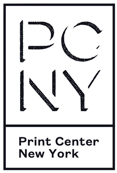
The reimagined logotype
The logo graphic is designed to be modular and applicable to a variety of compositions.
Its drop shadow and negative space emulate the raised surface of a stamp.
The abbreviation of PCNY is always in Lulo Three and the graphic should always feature a boxed-border, with stroke weight changed in increments depending on its scale. The full title of the Print Center is a subtitle/caption either beneath or next to the abbreviation in Founders Grotesk, also changing in weight depending on scale of the graphic.

The main component to many of the brand assets are bitmapped images of printmaking techniques/artworks and color blocking — emulating the physical processes of rolling inks onto printing plates and the intricate textures of the art form.


Typefaces used
Lulo Three
Founders Grotesk
Brand Guidelines
Some of the guidelines I created for the new museum identity.


bottom of page